A local business website should do more than look professional. It should help people understand what you offer, trust your business, find you easily, and take the next step.
For a local business, a website has a very specific job.
Someone searches for a service.
They find your business.
They visit your website.
Within seconds, they want to know:
Is this the business I'm looking for?
Do they serve my area?
Can they solve my problem?
Can I trust them?
How much information do I need before contacting them?
What should I do next?
If your website makes those answers difficult to find, potential customers may leave before ever contacting you.
That is why a high-converting local business website isn't simply about attractive design.
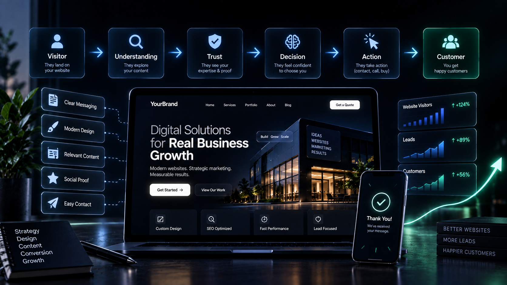
It is about creating a clear path from:
Discovery → Understanding → Trust → Action
And every part of the website should support that journey.
What Is a High-Converting Local Business Website?
A high-converting website is one that helps a meaningful percentage of relevant visitors take the action the business actually wants.
That action might be:
Calling the business
Sending an enquiry
Booking an appointment
Requesting a quote
Starting a WhatsApp conversation
Visiting a physical location
Purchasing a product
Scheduling a consultation
Submitting a contact form
The important point is that conversion depends on the business model.
A restaurant may want reservations.
A lawyer may want consultation enquiries.
A clinic may want appointments.
A local contractor may want quote requests.
A salon may want bookings.
A real estate business may want property enquiries.
So the first question isn't:
"How do we get more conversions?"
It is:
"What should a visitor do next?"
A website with a clear primary goal is much easier to design, write, measure, and improve.
The Local Customer Journey Is Different
Local customers often have strong intent.
Someone searching for:
"dentist near me"
is different from someone casually reading about dental care.
Someone searching for:
"best interior designer in Delhi"
may already be evaluating businesses.
Someone searching for:
"emergency plumber near me"
may need immediate action.
This means local websites need to reduce friction.
The visitor shouldn't have to investigate your business like a detective.
Your website should quickly communicate:
What you do → Where you operate → Why you're credible → What the visitor should do next
1. A Clear Value Proposition Above the Fold
The first section of your website has an important job.
It should immediately answer:
What do you do?
Who do you help?
Where do you operate?
Why should someone care?
For example, instead of:
"Welcome to Our Website"
a local business could communicate something more useful:
Professional AC Repair in South Delhi
Fast, reliable AC repair and maintenance for homes and businesses across South Delhi.
The second version provides context immediately.
The visitor doesn't need to scroll to understand the business.
A strong hero section can include:
Clear headline
Short supporting statement
Primary CTA
Secondary CTA where useful
Service/location context
Trust signal
Relevant visual
The goal is not to say everything.
The goal is to make the next question easy to answer.
2. Make the Local Connection Obvious
Local relevance should not be hidden.
If you serve a specific city, neighbourhood, region, or service area, communicate it naturally.
Visitors want to know:
"Do you actually serve my area?"
Your website can communicate this through:
Location-specific messaging
Service-area pages
Contact information
Address
Embedded map where appropriate
Local testimonials
Service locations
Relevant local examples
Clear business information
But avoid forcing city names into every sentence.
Local relevance should feel natural, not like keyword stuffing.
3. Make Your Services Easy to Understand
A common local-business website problem is vague service descriptions.
For example:
"We provide complete solutions for all your needs."
That doesn't help much.
Visitors need to understand exactly what they can get from you.
Instead, structure services around real customer needs.
For example:
Home Cleaning
Deep Cleaning
Kitchen Cleaning
Bathroom Cleaning
Move-In / Move-Out Cleaning
Regular Home Cleaning
Each service can explain:
What it is → Who it's for → What is included → Why it matters → How to enquire
Clear service communication reduces uncertainty.
4. Give Every Important Page a Purpose
A website shouldn't exist simply because every business is expected to have one.
Every important page should have a job.
For example:
Page | Primary purpose |
|---|---|
Homepage | Explain the business and guide visitors |
Service page | Explain a specific service and generate enquiries |
About page | Build credibility and human connection |
Location page | Establish local relevance |
Contact page | Make contacting the business easy |
FAQ | Remove common objections |
Blog / Resources | Educate and build authority |
This follows an important principle:
One page → One primary goal
The website becomes easier to understand when each page has a clear purpose.
5. Build Trust Before Asking for the Conversion
A visitor who doesn't know your business needs a reason to trust it.
Especially for local services, trust can determine whether someone calls you or chooses another business.
Useful trust signals include:
Customer reviews
Testimonials
Case studies
Client logos where relevant
Credentials
Certifications
Years of relevant experience
Real photographs
Team information
Clear business information
Transparent process
Service guarantees where appropriate
But don't add testimonials simply because every website has them.
Ask:
What doubt does this proof remove?
If visitors are worried about quality, show quality-related proof.
If they're worried about reliability, show evidence of reliability.
If they're evaluating an expensive service, case studies may be more useful than generic praise.
Proof should support the conversion decision.
6. Use Real Photos When They Strengthen Trust
Local businesses often have an advantage that large anonymous websites don't:
They are real businesses serving real people in real places.
Use that advantage.
Where appropriate, show:
Your team
Your location
Your storefront
Your workspace
Your products
Your work
Completed projects
Behind-the-scenes activity
Stock photography can make a business feel generic.
Authentic visuals can make it feel real.
The goal isn't to fill the website with photographs.
The goal is to provide useful evidence.
7. Make the Primary CTA Obvious
A visitor shouldn't have to figure out how to contact you.
If the primary goal is a phone call:
Call Now
If it is a consultation:
Book a Consultation
If it is a quote:
Request a Quote
If it is a booking:
Book an Appointment
If WhatsApp is genuinely part of the customer journey:
Chat on WhatsApp
CTA labels should communicate the action clearly.
Avoid vague buttons such as:
Click Here
Submit
Learn More
when a more specific action is possible.
8. Don't Give Visitors Too Many Choices
More options don't always create more conversions.
A page containing:
Call
WhatsApp
Email
Book
Download
Subscribe
Follow
Request Quote
Learn More
View Portfolio
can create decision friction.
A better approach is to establish:
Primary action
and, where necessary:
Secondary action
For example:
Request a Quote
or
Call Us
The right number of CTAs depends on the business and customer journey.
The principle is simple:
Make the next step obvious.
9. Mobile Experience Is Critical
For local businesses, the mobile experience deserves special attention.
A visitor may discover a business while:
Standing outside a shop
Travelling
Looking for a service nearby
Comparing businesses
Trying to call immediately
Searching during an urgent situation
If the mobile website is difficult to use, the opportunity can disappear quickly.
A strong mobile experience should provide:
Readable text
Clear navigation
Fast loading
Comfortable tap targets
Visible CTAs
Easy-to-use forms
Click-to-call functionality where appropriate
Easy location information
Minimal unnecessary friction
Mobile design isn't simply about making desktop design smaller.
It is about designing around the way people actually use the website.
10. Make Contact Frictionless
A contact form should not feel like an application process.
Ask only for information that is genuinely necessary at that stage.
For example:
Name
Phone / Email
Service Needed
Message
may be enough for an initial enquiry.
Depending on the business, additional fields can be useful.
But every additional field introduces another potential point of friction.
Ask:
What information do we actually need to take the next step?
Not:
What information could we possibly collect?
11. Make Your Phone Number and Location Easy to Find
For a local business, basic information can be extremely valuable.
Make important details easy to access:
Phone number
Address
Business hours
Service area
Email
Directions
Booking information
Don't hide the phone number only on the Contact page.
If calling is an important conversion action, it should be accessible throughout the customer journey.
12. Use Local SEO as Part of the Conversion System
Local SEO and conversion optimization should not operate separately.
Getting discovered is only the first step.
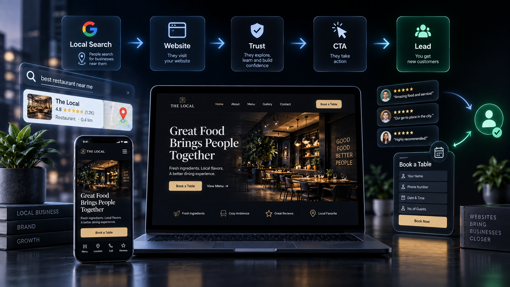
A useful local journey is:
Local Search → Website → Trust → Conversion
Your website should reinforce the local relevance established through search.
That means clearly communicating:
What the business does
Where it operates
Which services it provides
Who it serves
How customers can contact it
Local SEO can help customers discover the business.
The website needs to give them a reason to choose it.
13. Create Useful Location and Service Pages
A business serving multiple areas may benefit from dedicated pages where there is a genuine reason for them to exist.
For example:
/services/web-design
/locations/delhi
/locations/gurgaon
But don't create dozens of nearly identical pages just to target locations.
Each useful page should provide meaningful information.
It might include:
Specific services
Local context
Relevant customer questions
Service availability
Examples
Testimonials
FAQs
Clear CTA
The principle is:
Create pages for users first, search engines second.
14. Answer the Questions Customers Actually Ask
People often hesitate before contacting a local business because they have unanswered questions.
For example:
How much does the service cost?
How long does it take?
Which areas do you serve?
Do you offer emergency service?
Do I need an appointment?
What is included?
What happens after I enquire?
Do you provide consultations?
Do you work with businesses or individuals?
Your website should answer important questions before the visitor has to ask them.
This reduces uncertainty.
And reducing uncertainty can make taking action easier.
15. Use FAQs Strategically
FAQs can be useful when they address genuine customer questions.
They can help with:
Objection handling
Clarity
Service expectations
Process explanation
Local information
Conversion confidence
But don't create an enormous FAQ section simply to add keywords.
A useful FAQ answers a question that could otherwise prevent someone from moving forward.
16. Show What Happens After the CTA
Sometimes people hesitate because they don't know what happens after they submit a form.
Instead of:
Submit
you can provide context:
Request a Consultation
Tell us what you need. We'll review your enquiry and get back to you about the next step.
This small amount of information can reduce uncertainty.
The visitor understands what they are agreeing to.
17. Design for Clarity, Not Decoration
Good design matters.
But conversion-focused design is not about adding more visual effects.
Every visual and interaction should have a reason to exist.
Strong design should help visitors:
Notice important information
Understand hierarchy
Find services
Recognize trust signals
Navigate easily
Identify the CTA
Take action
A beautiful website that hides the important information is not necessarily a high-converting website.
Clarity beats decoration.
18. Website Speed Matters to the Experience
A slow website creates friction.
Visitors may abandon pages before they understand the business.
Performance should therefore be considered part of the website experience.
Focus on:
Optimized images
Efficient code
Appropriate hosting
Reduced unnecessary scripts
Good caching
Responsive design
Performance monitoring
Performance isn't merely a technical metric.
It affects how the website feels to the person using it.
19. Use Analytics to Understand What Is Actually Happening
You cannot reliably optimize what you don't measure.
Depending on the business, useful metrics can include:
Website visitors
Traffic sources
CTA clicks
Phone clicks
Form submissions
Booking actions
WhatsApp clicks
Page engagement
Exit points
Conversion rate
Lead quality
The goal isn't to collect every possible metric.
It is to understand:
Where are people coming from?
What are they doing?
Where are they dropping off?
Which actions lead to real business opportunities?
20. Optimize the Website After Launch
Launching the website isn't the end.
It is the beginning of the measurement cycle.
A useful model is:
Launch → Measure → Learn → Improve → Test → Repeat
For example:
A business notices that many visitors reach the service page but few contact them.
Possible questions:
Is the CTA clear?
Is the offer understandable?
Is there enough trust?
Is the page answering objections?
Is the form too long?
Is pricing unclear?
Is the mobile experience creating friction?
The solution should come from evidence rather than guesswork.
A High-Converting Local Website Framework
A practical local-business website can be thought of as seven connected layers:
01 — Clarity
What do you do?
Make the business and offer immediately understandable.
02 — Relevance
Is this for me?
Show the right service, audience, and local context.
03 — Trust
Can I believe you?
Use reviews, proof, experience, credentials, examples, and authentic information.
04 — Experience
Is this easy to use?
Create a fast, accessible, mobile-friendly experience.
05 — Answers
What do I need to know before deciding?
Address questions, objections, pricing context, process, availability, and expectations.
06 — Action
What should I do next?
Make the primary CTA obvious and easy.
07 — Optimization
Is it actually working?
Measure behavior and business outcomes, then improve.
The system becomes:
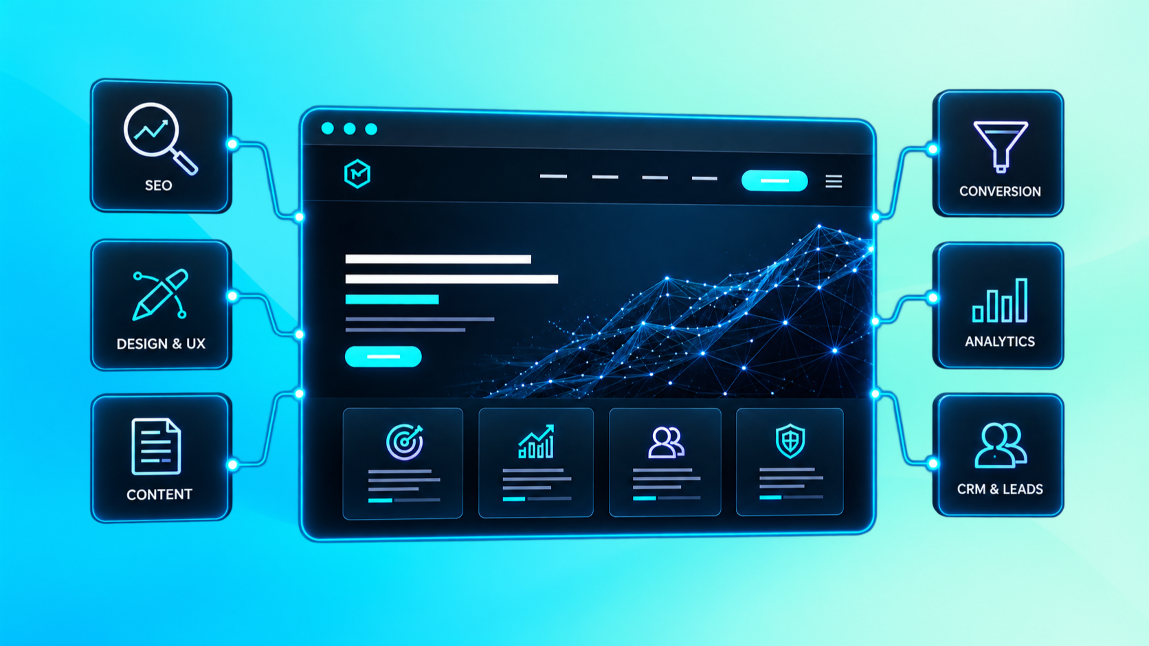
Clarity → Relevance → Trust → Experience → Answers → Action → Optimization
Common Local Business Website Mistakes
Mistake 1: Starting With the Business Instead of the Customer
Visitors don't necessarily care about your complete company history.
They want to know whether you can help them.
Lead with their problem, need, or desired outcome.
Mistake 2: A Beautiful Website With No Clear CTA
Good design can attract attention.
But attention without direction doesn't create action.
Mistake 3: Hiding Important Information
If visitors need to search for your phone number, location, services, or booking option, the website is creating unnecessary friction.
Mistake 4: Generic Service Pages
"Complete solutions for all your needs" doesn't tell visitors enough.
Be specific.
Mistake 5: Fake or Generic Trust Signals
Trust is strongest when it is specific and authentic.
Use real reviews, real examples, real credentials, and real experiences wherever possible.
Mistake 6: Designing Only for Desktop
If the mobile experience is difficult, you may lose people before they ever reach your CTA.
Mistake 7: Treating SEO and Conversion as Separate
Traffic is useful only when the website can turn relevant attention into meaningful action.
Mistake 8: Launching and Forgetting
A website should evolve as the business, audience, offers, and performance change.
A Simple Local Business Homepage Structure
If you're building a website from scratch, a structure like this can provide a strong starting point:
1. Hero
What you do + who you help + location + primary CTA
2. Trust
Reviews, credentials, experience, or key proof.
3. Services
Clear overview of the main services.
4. Why Choose Us
Relevant differentiators and customer benefits.
5. How It Works
A simple process that reduces uncertainty.
6. Work / Results
Projects, examples, case studies, or relevant proof.
7. FAQs
Important customer questions and objections.
8. Location / Service Area
Where you operate and how customers can find you.
9. Final CTA
A clear next step.
This isn't a universal template.
The right structure depends on the business, audience, offer, search intent, and conversion goal.
The Real Formula for a High-Converting Local Website
A useful way to think about the entire system is:
**Right Audience
Clear Offer
Local Relevance
Strong Trust
Useful Content
Good UX
Clear CTA
Low Friction
Measurement
Continuous Optimization**
= A stronger conversion system
Notice what isn't on the list:
More animations.
More pages.
More buttons.
More text.
More features.
Conversion doesn't come from adding everything.
It comes from making the right things easier.
What Should a Local Business Prioritize First?
If resources are limited, start with the fundamentals.
Priority 1: Clarify the offer
Make sure visitors immediately understand what you do.
Priority 2: Improve trust
Add authentic proof that addresses customer concerns.
Priority 3: Make the CTA obvious
Give visitors a clear next step.
Priority 4: Improve mobile UX
Make the experience easy to use on smaller screens.
Priority 5: Improve local relevance
Clearly communicate your services and service areas.
Priority 6: Reduce friction
Simplify forms, navigation, and contact actions.
Priority 7: Measure
Track meaningful interactions and lead quality.
Priority 8: Keep improving
Use real behavior and business results to guide future changes.
The BVHQ Perspective
A website should not simply exist because a business needs an online presence.
It should have a purpose.
For a local business, that purpose may be to:
Build confidence → Become discoverable → Explain the offer → Remove uncertainty → Create an enquiry → Support growth
This aligns with the broader BVHQ approach of treating a website as a digital asset rather than simply a project, with business objectives coming before deliverables and continuous improvement continuing after launch.
The right digital presence starts with understanding the business, its audience, its goals, and the opportunities within its current digital experience.
For a local business, a high-converting website is ultimately not about making the website do everything.
It is about making the next step obvious.
Key Takeaways
A high-converting website starts with a clear business goal.
Local relevance should be obvious without becoming forced or repetitive.
Visitors should quickly understand what you offer and who you serve.
Trust signals should address real customer concerns.
Every important page should have a clear purpose.
Mobile UX and performance are part of the conversion experience.
CTAs should make the next action obvious.
Contact forms should collect what is necessary, not everything possible.
Local SEO and conversion optimization should work together.
FAQs should answer genuine questions and objections.
Analytics should measure meaningful actions and lead quality.
A website should be continuously measured and improved after launch.
The best local business websites don't make visitors work hard.
They make the decision easier.
Find the business.
Understand the offer.
Trust the business.
Take the next step.
That's what a high-converting local website should do.
Frequently Asked Questions
What makes a local business website high-converting?
A clear offer, strong local relevance, authentic trust signals, good mobile UX, useful information, obvious CTAs, low-friction contact options, and continuous measurement all contribute to a stronger conversion experience.
Should a local business website have a phone number on every page?
If phone calls are an important conversion channel, making the number easily accessible throughout the website can reduce friction. The exact implementation depends on the business and customer journey.
How many CTAs should a local business website have?
There is no universal number. The important principle is to establish a clear primary action and avoid overwhelming visitors with competing choices.
Does local SEO help website conversions?
Local SEO can help relevant customers discover a business, but discovery alone isn't enough. The website still needs to communicate relevance, credibility, value, and a clear next step.
Should every local business have a blog?
Not necessarily. Content is useful when it helps answer customer questions, build authority, support search visibility, or assist the buying decision. A blog should serve a purpose rather than exist simply for the sake of publishing.
How often should a local business website be updated?
There is no fixed schedule. Review the website when services, pricing, business information, customer expectations, positioning, or performance changes. Use analytics and customer feedback to identify opportunities for improvement.
Final Thought
Your website is often one of the first places a potential customer decides whether your business feels credible, relevant, and worth contacting.
It doesn't need to be complicated.
It needs to be clear.
It needs to be useful.
It needs to build confidence.
And it needs to make the next step obvious.
Your digital presence should work for your business — not simply exist online.